Get N colours from a continuous colourmap in matplotlib 🎨
During this week, I researched how to discretize a continuous colour palette with matplotlib. I had this problem with doing a data visualization in which I needed a sizeable discrete colour palette (i.e. 20). So, the solution is easily findable on the web if you’ve dealt with colourmaps in the past. However, I want to wrap up the why of the problem and how to solve it.
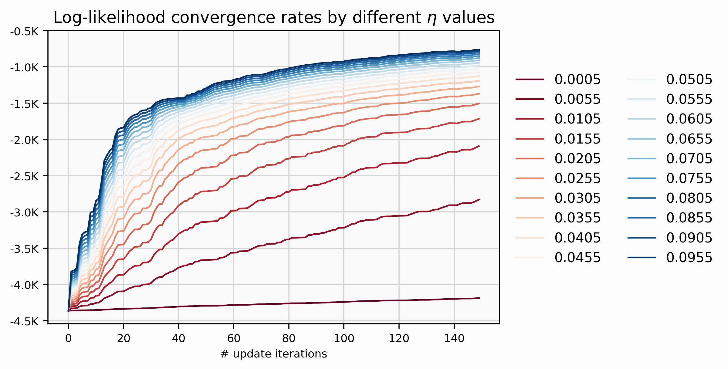
The above visualization shows 20 different lines that exhibit a clearly
convergence rate pattern between the hyperparameter \(\eta\) and some
performance measure such as the log-likelihood.
How can we map the \(\eta\) values to its specific lines? The natural option
is used colours, but you immediately notice that we have a problem with such large quantity
of different values for \(\eta\). Ok, it’s not really a problem, you can just
designed a custom_palette (e.g. MetBrewer repo)
and code as follow:
from cycler import cycler
import matplotlib as mpl

custom_palette = ['#hexcode_1', ..., '#hexcode_20']
custom_cycler = (cycler(color=custom_palette))
plt.rc('axes', prop_cycle=custom_cycler)
If you didn’t know what Cycler is, it is just a
convenient way that matplotlib provides to iterate for different style options
such as colours, line styles, and others.
But wait…, there is a constraint here; we want to exhibit a pattern through the colours–as we increase the magnitude of \(\eta\) the log-likelihood convergence rate increase as well–so we need this notion of a gradient. Look at the \(\eta\) values; there are jumping in regular steps of 0.005. That could be annoying for picking a colour’s sequence because we would have to be accountable for the regularity between any consecutive colours.
So, a continuous colormap (CMAP) solve the previous issue, just we need a way
to discretize and pick N=20 colours.
cmap = plt.get_cmap(CMAP, N)
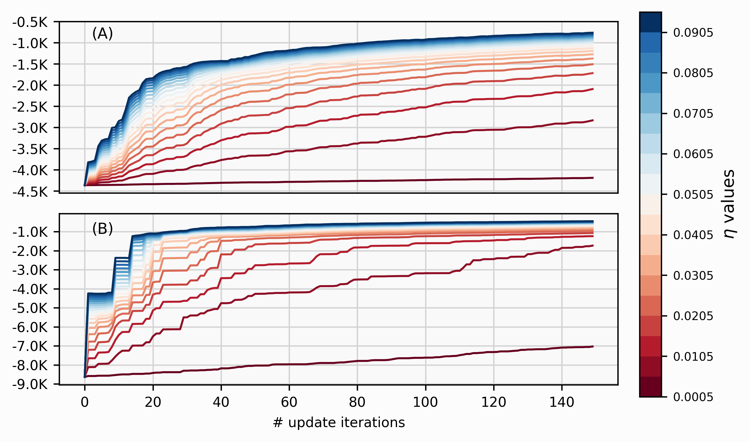
custom_palette = [mpl.colors.rgb2hex(cmap(i)) for i in range(cmap.N)]Can we do better? Yes! It is possible to decouple the precision from the colour mapping to each of the 20-labels by highlighting particular lines (e.g. best, worst) using annotations. Then use a colourbar to communicate the \(\eta\)’s effect on the convergence rate as its value increases. The visualization will be way cleaner than the above visualization with two columns of labels.
The trick
is done by ScalerMappable and requires passing two elements:
- A
cmapthat can we recover from our custom_paletteListedColormap(custom_palette)or using directly the original (‘RdBu’ in this case) - A boundary on each discrete colour in the colourbar using
BoundaryNormthat takes two inputs: the list and length of values (i.e. different \(\eta\) values)
from matplotlib.colors import ListedColormap, BoundaryNorm
from matplotlib.cm import ScalarMappable

cbar = plt.colorbar(ScalarMappable(norm=BoundaryNorm(learning_rates,
                                                     ncolors=len(learning_rates)),
                                   cmap=ListedColormap(custom_palette)));
cbar.ax.tick_params(labelsize=7) 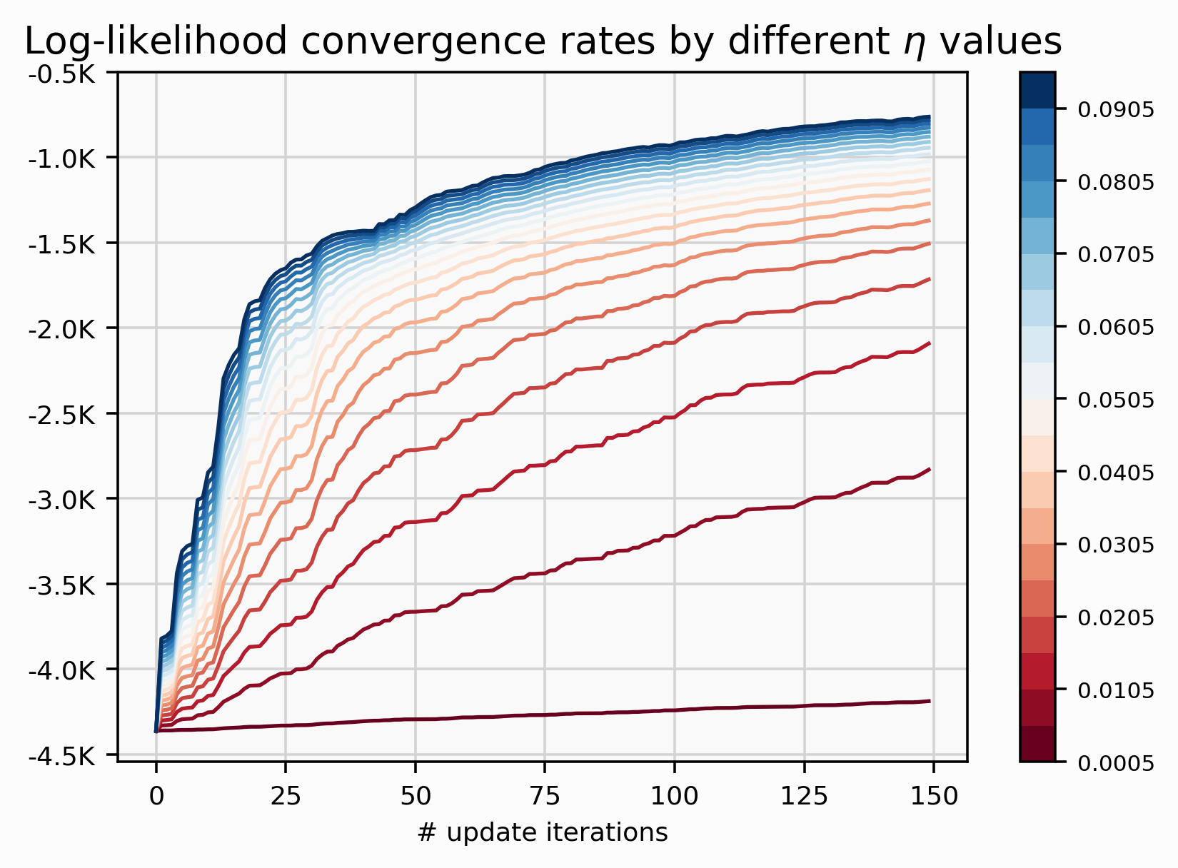
That’s the way computer talks to each other.